Puddle Guidelines
View On GitHub View Style Patterns View GuidelinesBrowser / Client Support
Below is a list of browsers and operating systems that Puddle currently supports. If something doesn’t look right in a browser or OS pair that we do support, then we should fix it. Some applications support basic functionality in certain older browsers in spite of display issues. See that application’s README (e.g., maji) for more details.
Browsers
- Safari 10+
- Chrome 60+
- Firefox 52+
- Internet Explorer 11+ (Only at Desktop Widths)
- Edge 14+
Operating Systems
- OS X 10.10+
- Windows 7+
- iOS 10+
- Android 5+
Frontend Standards
Below are a few suggestions about how to work within our frontend system from the design side of the stack. These are suggestions as most of the existing codebase follows these rules.
Legacy Fonts
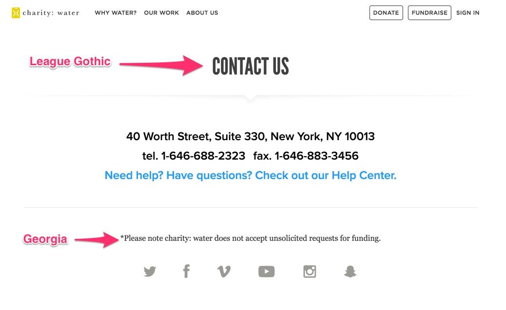
There are some legacy pages that League Gothic and Georgia. Moving forward, all pages should be using Proxima Nova.
Sketch
Our mockups are designed in Sketch. Sketch is nice because it integrates with sketch puddle and makes it easier for us to identify font sizes and match up color hex codes with puddle variables. Often, the sketch files get out of date from what’s on the website. This is because once we have the initial designs, some updates go straight to code and don’t always need a design. When future design iterations happen, it’s important to point out only the required change. This way, the engineer working on the page doesn’t think the entire page and copy has to change. An example of this can be found within our brand partnerships page. As an engineer, here are a few general things that make it challenging for us to work with sketch designs:
- Proper layer stacking and general organization. A big part of what we need sketch for us to grab assets from the design. If there’s an “invisible box” over images, it makes it hard to select layers.
- Multiple artboards with almost the same design. It’s sometimes easier to have different proof of concepts within the same sketch document. It makes it hard for us to know which design to pull from. An example of this can be found within our why water page and september campaign 2015 page.
- Small assets. Our images are mostly exported 2x the size in order to look good on retina devices. It makes it hard if we pull out an image and it’s too small.
- SVGs! We like to use SVGs wherever possible. Sketch does a nice job with SVG syntax, but sometimes, illustrator has issues when there are issues with connecting paths and making sure fills are correct.
There are a few exceptions to note. The september campaign 2015 page is a unique branded page. We have different fonts and unique branding elements that are special to this page. You can see that with in the sketch document when we display a few examples of different sections. You can also see how the layers and groups are nicely put together.
Design handoff
Ideally, the design gets discussed in small iterations with the engineer working on the project. In a perfect world, there is no physical handoff. This gives the engineer an opportunity to raise any flags about something going out of scope of if there’s a quicker solution to the problem. It also gets the engineer thinking about the design and creates a open line of communication for collaboration.
Web designing from an engineering eye
We pay great attention to detail before pushing up a change to production. There are a lot of little details that we try to catch as pages are being developed. Below are some of those examples.
No word left behind
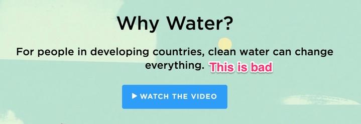
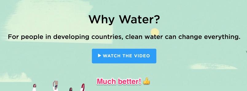
This especially applies to the words charity: water.
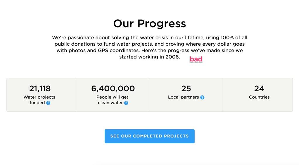
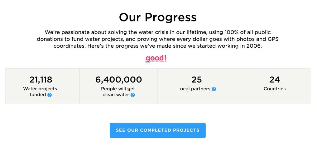
Images that start with a solid color.
This makes it really easy to find an image that works well for a mobile pattern.

Limit words over faces

Good use of line widths
Line widths, especially with lots of text should be evened out.
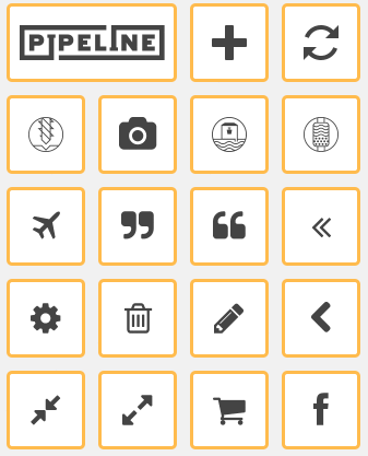
Icomoon Documentation
Our icons font is managed by an app called IcoMoon. We’re also using icomoon to host our fonts though S3 and cloudfront. This document will give instructions on how to makes updates such as additions, deletions, and more.
Requirements / Introduction
You need an account to move forward. For security reasons, please see IT for a login/password.
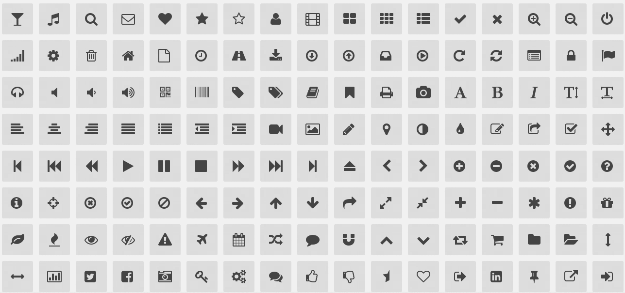
After you’ve logged in you’ll see a screen like this:
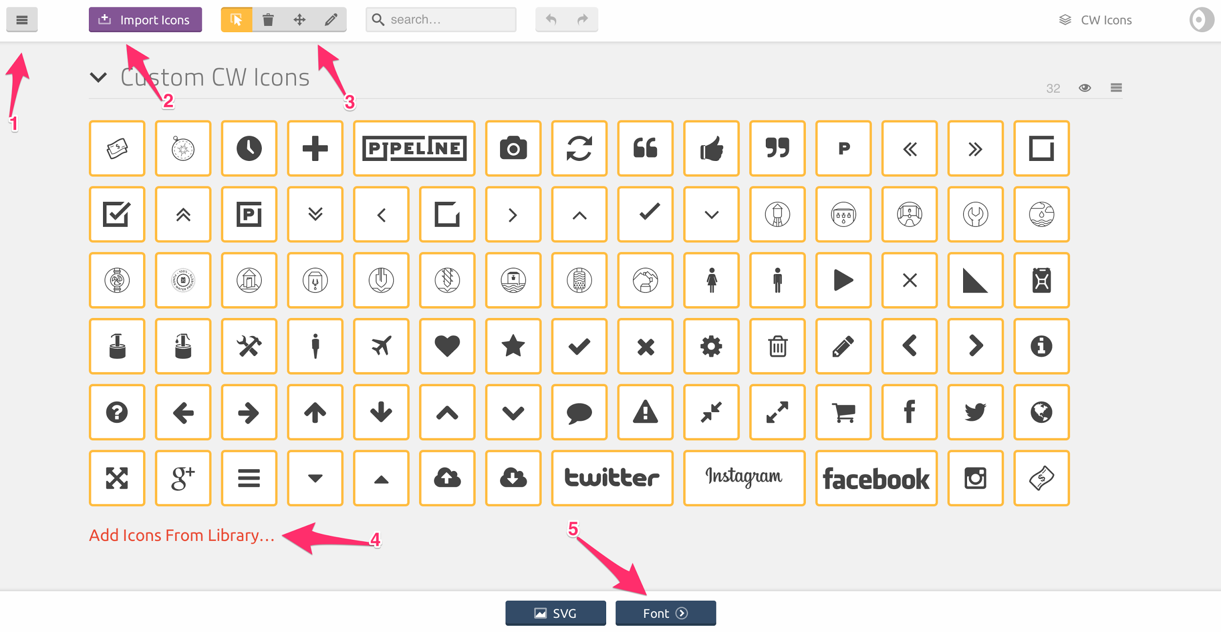
- This is the menu for managing other sets (right now we just have the 1), docs, and other useful info
- This is how you can add custom icons
- This is the toolbar for editing a specific icon or removing an icon
- This is how you can add icons from other libraries
- This is where you preview the font and get the links
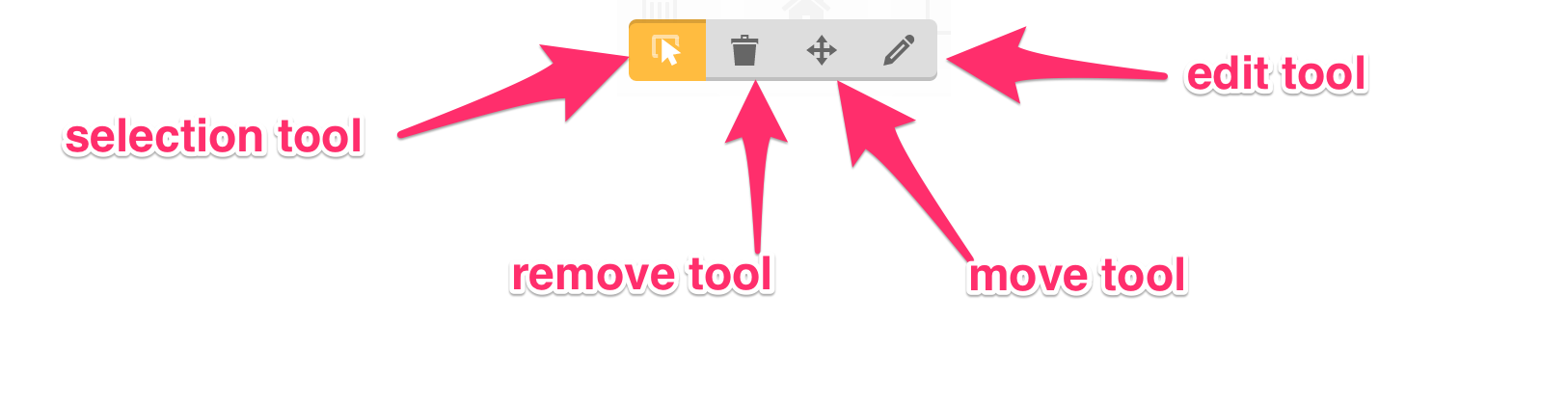
Here’s more detail about the toolbar in #3
Adding Icons
You can add icons in two different ways
- Uploading custom icons
- Upload a custom icon into the current set
- Choose from other icon libraries
Uploading custom icons
- Click on the Import Icons button in the header
- Choose the file you’d like to upload within the open file dialog
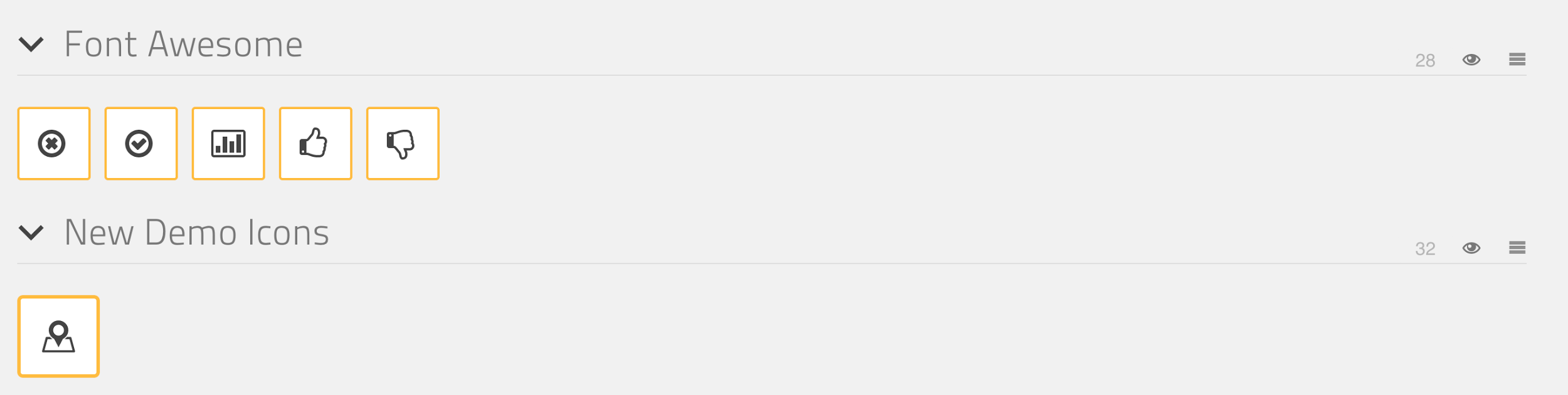
- The new icon will appear in a new set above cw-icon. The arrow is pointing to where you can update the meta info such as the new set’s name. Only use this option to categorize similar icons like social, media (play, pause, stop), arrows, etc…
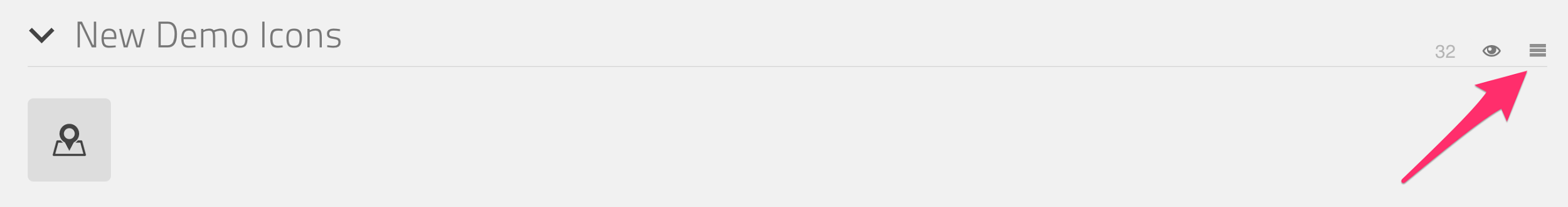
Select the new icon and now it’s added to the project.
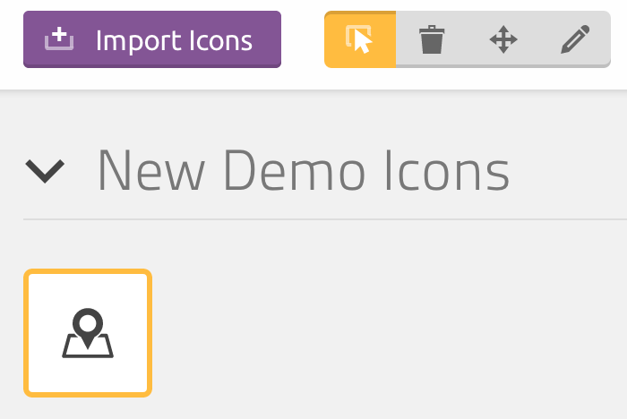
Upload a custom icon into the current set
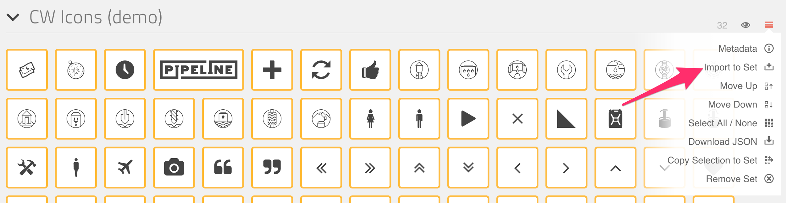
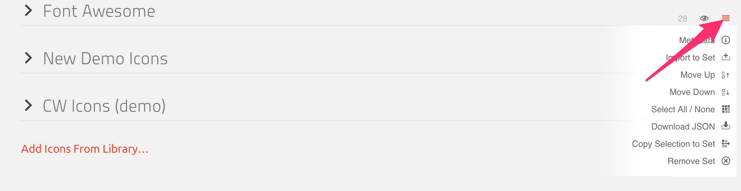
- Click on the right hand menu of the main cw icon set. There’s a menu option for ‘Import to set’
- After you choose the icon, you can make your edits
- Make sure to select it. If you don’t it won’t be saved in the actual font
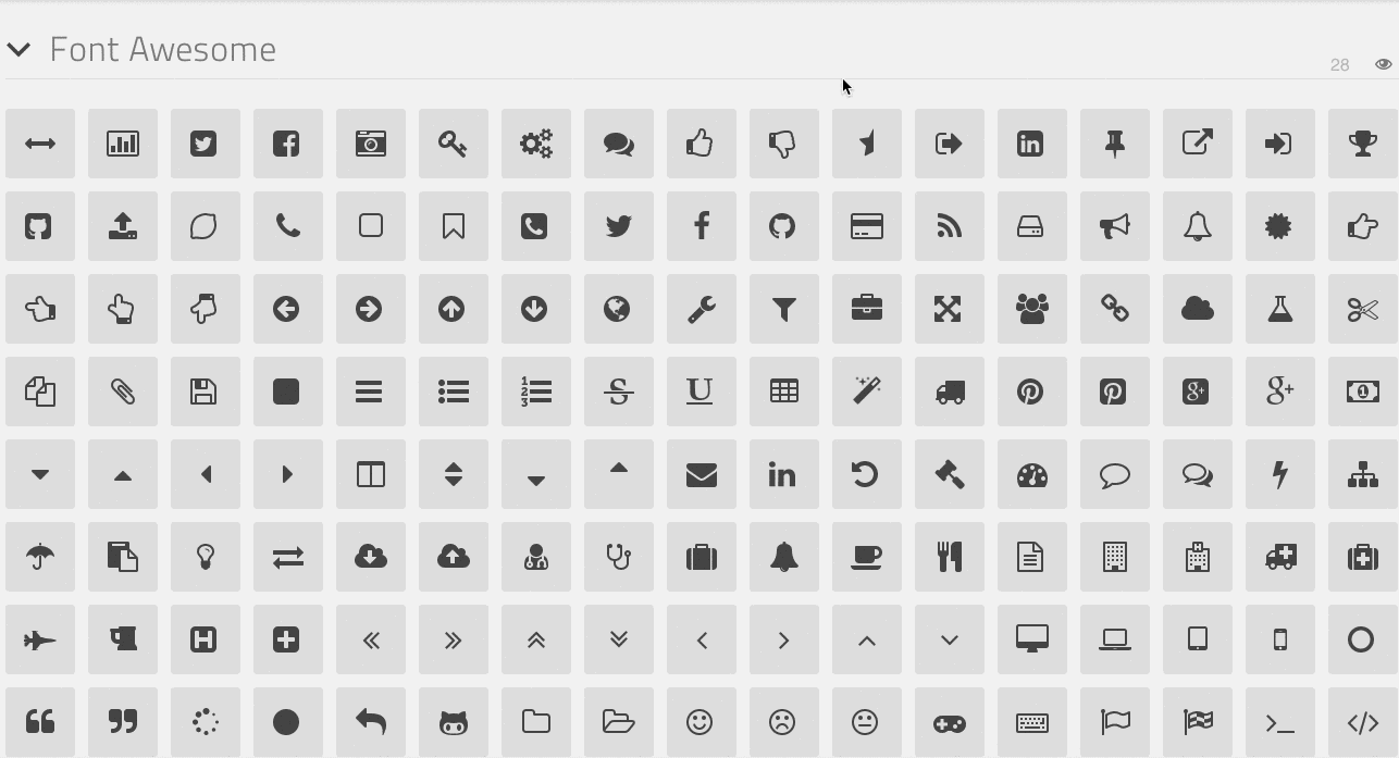
Choose from other icon libraries
- Click on the ‘Add icons from library’ link at the bottom of the project screen
- This will open up this page
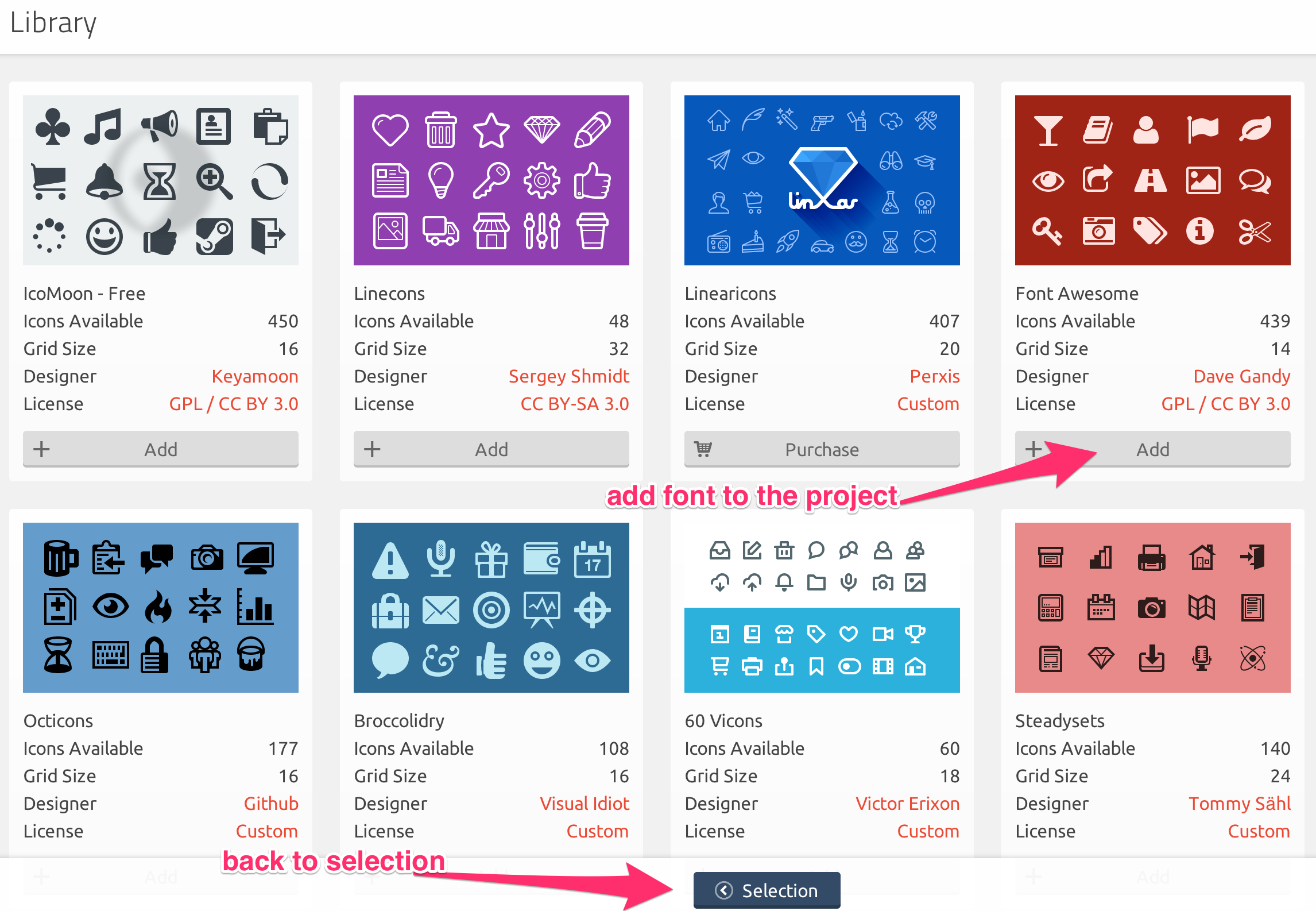
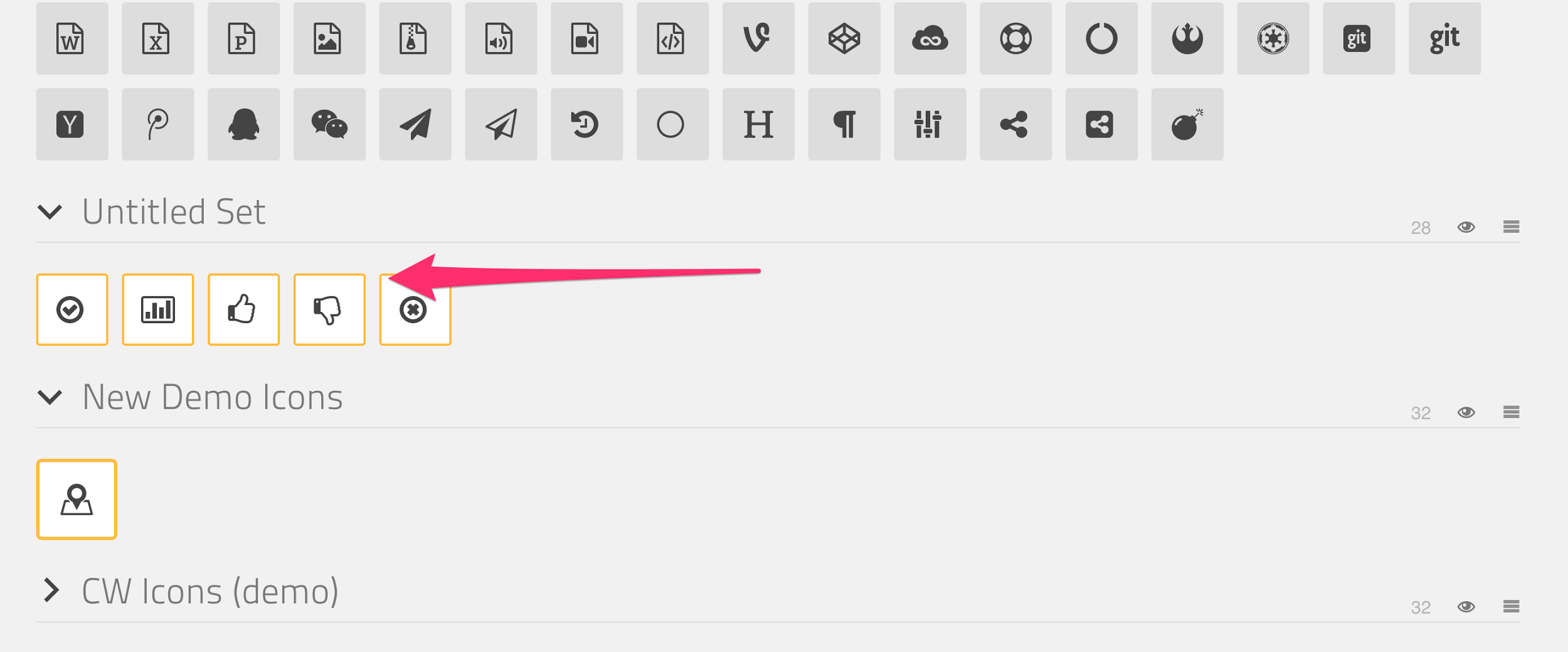
This will add a bunch of new icons to the font project. Click on the menu to make edits.
You can expand your new library, and choose any icons that need to be added. You can also remove additional icons that aren’t needed with the remove tool. That will look something like this
If you ever wanted to use other fonts from that library you have the option to restore it
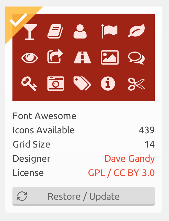
If you do restore, it’s going to put your previous selection into a new set
Basic User Interactions
Moving Icons
Use the move tool from the top tool bar. You can do this for better organization. Choose the move tool, click and drag.
Removing Icons
Use the remove tool from the top tool bar. You click click once to remove or click and drag to remove multiple icons at once. This is useful for adding in other kits and removing out the clutter of icons that aren’t going to be used.
Editing Icons
Use the edit tool from the top tool bar. It will open up a dialog that allows you to move and scale the icon within it’s box.
Editing icons for usage
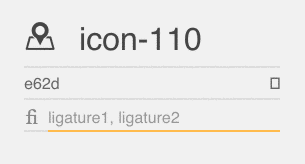
You’ll want to keep the new icons you add clean. So make sure to update the icon name to something descriptive and also add ligatures so they can be used in photoshop or sketch.
Use the fi button to toggle ligatures 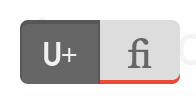
Edit the icon name and ligatures like this:
Warnings
Don’t remove icons without telling a front end engineer. This will break that icon wherever it’s used on our site.
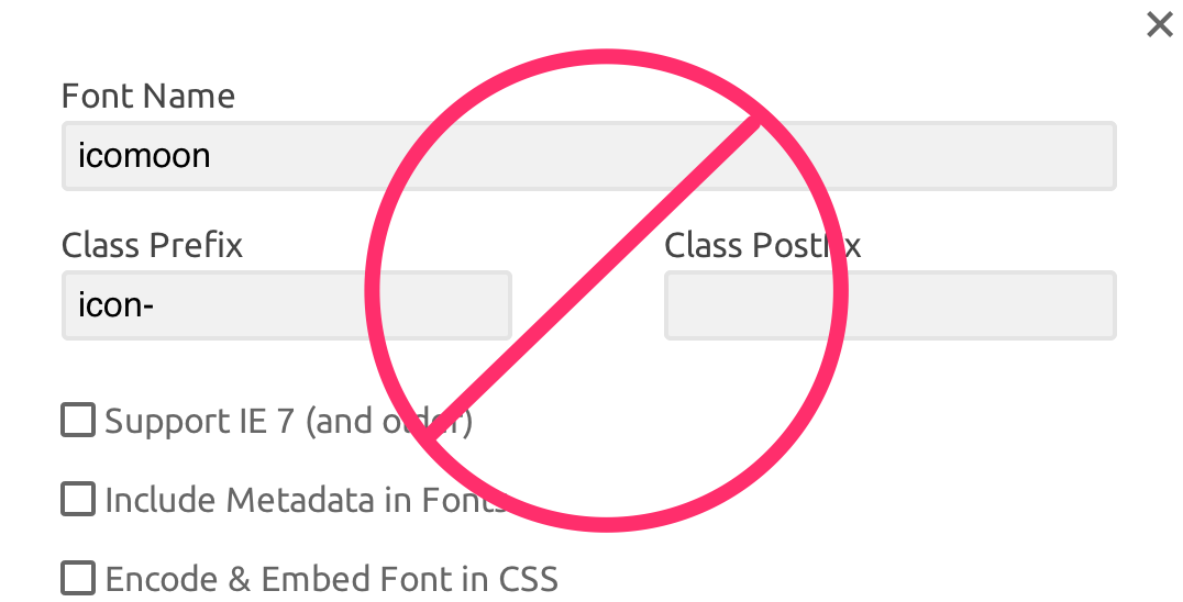
Don’t update the font name or class prefix in the preferences. This will break places where we’ve called our the icon by name or insert it through javascript
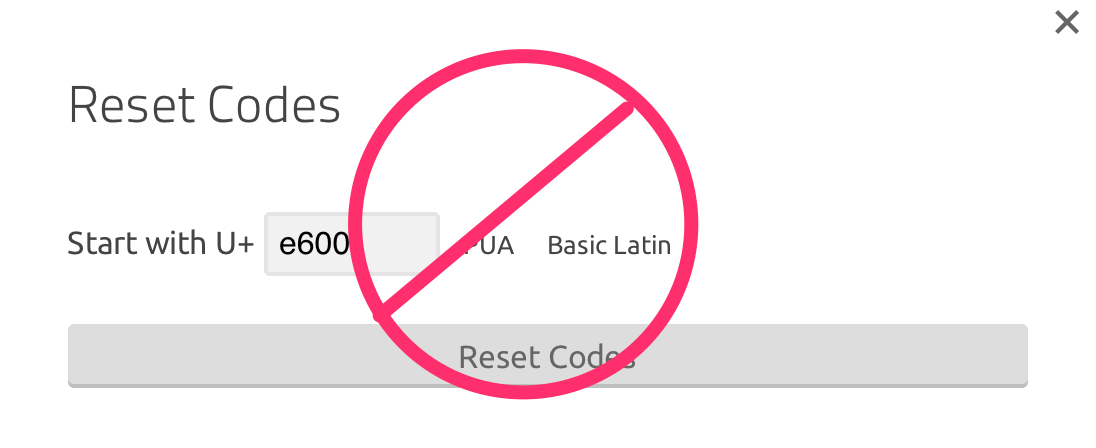
Don’t reset codes
Don’t rename icons. That’s basically the same as removing because our code won’t know what the renamed icon is.
Web Fonts
We host our own Proxima Nova font files, purchased from Fontspring, which we use for all of our environments. Proxima Nova is our default sans-serif font-family.
As in the case of Puddle’s images, these font files are uploaded to S3 during deployment and served through Cloudfront.